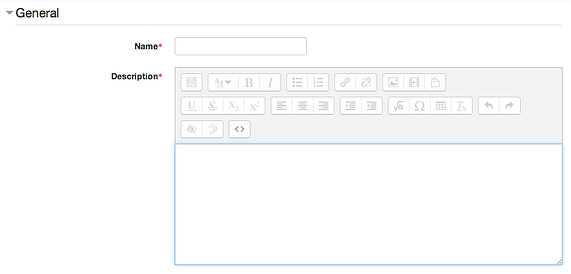
 If you are a teacher or instructor who uses a learning management system (LMS) to share resources and activities with your learners, you're probably familiar with a screen that looks like this:

This 'what you see is what you get' (WYSIWYG) visual editor is used for creating:
- Web pages and reading resources
- Assignments
- Quizzes and tests
- Blog posts
It's similar to what you probably use to write emails, or a simplified version of your favorite text editor. But are you using it correctly to produce content that is properly structured and styled for the web?
Behind your formatting is HTML
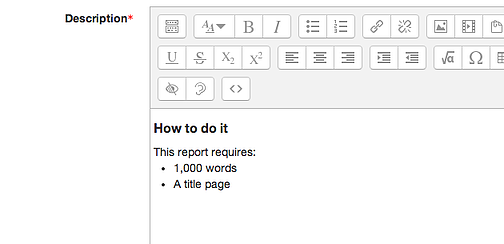
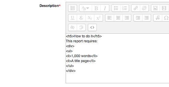
What you're actually seeing as visual cues in the visual editor—think bolding, italics, and so on—is created with HTML markup. HTML uses plain text tags to dictate the appearance and functioning of headings, text, lists, links, images, tables and other elements within a web page. You can actually see the source markup your visual editor creates, by clicking the source button. This...

... has markup that looks like this:

Okay—before we dig any deeper—let's look at why you'd even want to bother knowing anything about HTML.
Properly marked-up web content is important for:
- Accessibility: Making sure your content is correctly read by screen readers and other accessibility tools that learners might be using
- Different browsers and readers: Learners might be using different web browsers or RSS readers, reading content through an application such as Pocket or Safari Reader, emailing it to themselves and reading it throw their email application, copy-pasting it into a document—all of which create variations in how content appears
- Control: A WYSIWYG editor makes content creation easy, but understanding the markup gives you much better control over your final product
Great. So you kind of, sort of, see the value of learning a little bit about the HTML that powers your LMS course content. Except you don't have the time or inclination to go and learn how to deal with a whole markup language.
No problem. You don't need to.
The shortcut to properly formatted e-learning content
Use the styling options.

It sounds so obvious, but there are some critical points to note:
- Use heading styles (H1, H2, H3) for headings, not just bold or italic
- Use bulleted or numbered lists, not hyphens or other typed characters
- Use indents, not multiple, manually-typed spaces
- Always write descriptions for images
- Don't just past link URLs verbatim, create descriptive anchor text and attach the link to it
Cheat and format your content in Word
If you're used to writing in Word and you use the software's built-in styling options, you can just copy-paste your content into the LMS's visual editor and it will automatically convert into properly formatted HTML markup.
A little HTML never hurt anyone
HTML syntax—while scary to look at when you don't understand it—is actually very simply to learn. If you're creating a lot of content in your LMS, learning the basics of markup will pay huge dividends: it will let you assert much better control of over the structure, formatting, and appearance of your content. W3Schools and Codecademy both offer easy tutorials that cover the basics.
Here's what it comes down to: spend a little time learning how your tools work. You'll use them better—and create much better products—as a result.


