Here’s 4 key features your Learning Analytics needs! Including ad hoc views, reports, dashboards, and schedulers. For the full rundown, watch our webinar: How To Utilize Data To Improve Operational and Learning Effectiveness.
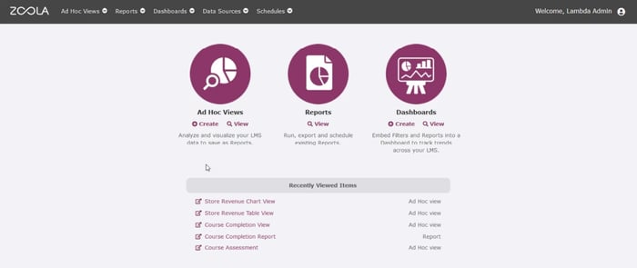
Lambda Analytics "Zoola" maximizes opportunities to use learning data analytics across workflows, including ad hoc views, reports, and dashboard formats for data analysis.
Key Learning Analytics Feature #1 - Ad Hoc Views
If you’re investing in a learning analytics platform for your HR or training program, you’re probably going to want to use it as much as possible! That means finding value in your software on an everyday basis, beyond official analytics reports to stakeholders, or a set schedule of data collection.
Lambda Analytics maximizes the opportunities to use Learning data analytics across workflows with Ad Hoc Views. The ad hoc designer is a data playground, where admins and L&D professionals can explore what’s happening in their learning management system.
Here, it’s possible to choose a set of data and then experiment with it through an intuitive drag and drop tools. Changing the way data is presented may reveal insights, or simply allow you to identify the most relevant baseline measures for your program. This is the first step towards building insightful reports, which is why it can be so useful to use a learning analytics platform that includes an exploratory feature.
Before things are cleaned up visually for a formal report or dashboard, the key to successful data analysis is finding that one metric that matters most for your learning. Running multiple reports, each with a different measure of success can get confusing, fast. So an ad hoc view really shows its value in helping you find the absolute best indicator(s) of performance.
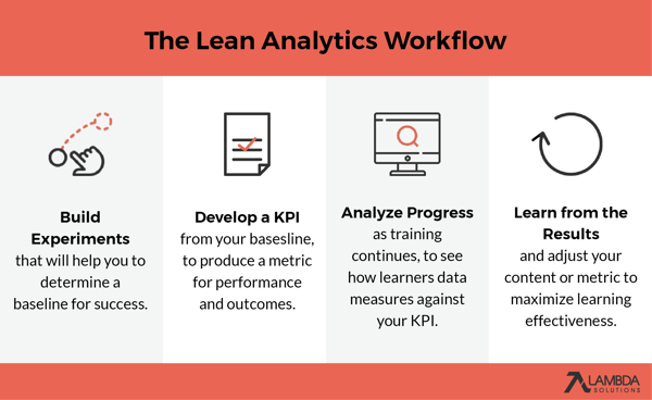
This is often referred to as Lean Analytics. In other words, using data analytics to develop the minimum number of metrics for the maximum results. The lean startup strategy can be thought of as a four-stage process:
- running experiments in an Ad Hoc View to search for performance insights,
- turning those insights into Key Performance indicators (KPIs),
- using analytics reports and dashboards to measure outcomes against those KPIs,
- learning from those results, repeating the loop until your desired outcomes are achieved.
 With flexible access to data and the ability to categorize, filter, and represent information in numerous ways, it’s possible to form a narrative about learning effectiveness. For instance, you might build an ad hoc report to compare grades on a course, before and after changes to teaching strategy.
Or, you could build a cross-tab or table to compare month-to-month grades across your five lowest-performing courses. For aggregated data, reports can also be scheduled to run and export at prearranged intervals, to build an impressive, persuasive story of your training.
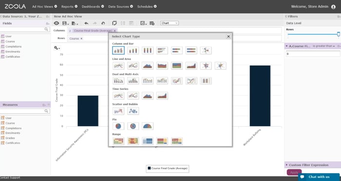
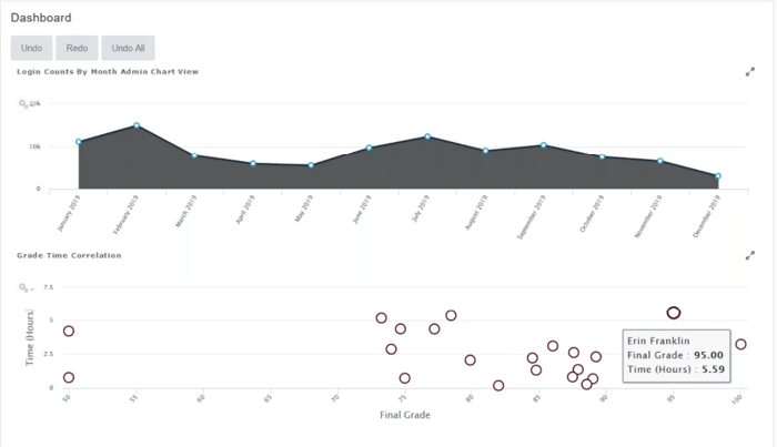 Select the chart type and format that will tell the best data analytics story to your stakeholders.
Key Learning Analytics Feature #2 - Analytics Reports
Beyond L&D teams, the wider organization will interact with data analytics through analytics reports.
Reports are an essential feature of any analytics platform because they are the primary means of communicating information with stakeholders. They shed light on exactly how learners are interacting with eLearning courses—the time spent learning, where learners most focus their attention, which courses are being fully completed, and so on.
This makes reports a great way to give educators, designers, HR, and wider stakeholders insights into the reality of what training really means inside your organization. As opposed to performance indicators, a report lets admins paint a picture of learning by selecting any number of data categories to present.
In this 30-minute Lambda Lab webinar, Stewart Rogers, VP of Product for Lambda Solutions will show you our Top 5 Tips for Keeping Reporting Simple.
KPIs Versus Reporting |
|
|
Key Performance Indicators are all about setting organizational goals (time spent learning, grades etc.) They are used as a yardstick for measuring performance and making changes according to the result. KPIs are personal—they encourage your business to set an individual number or goal, and work towards it. |
Reporting is an output rather than an objective. Reports are basically lists of things—things normally requested by teams/managers/clients. (‘Send me a list of everybody from x who does y.’) Reports can be scheduled, automated, and communicated across organizations. |
Lambda Analytics "Zoola" contains a whole bunch of ready-to-populate reports. But you can also build your own, by deciding on what data fields should be included and how they are represented, sorted, or filtered.
Though you might think of reports as the driest and most traditional aspect of learning analytics, their appearance can still be customized to enhance communications. Look for an analytics platform that includes colour and font choices, and other options for matching reports to company themes, branding, or your latest presentation.
Here are a few examples of Lambda Analytics reports, which work with both Moodle and Totara Learn LMS:
|
Enrollment: who hasn’t yet enrolled? |
This report tells admins and instructors who has not enrolled in courses within the LMS. The report can be filtered by course, categories, assignment, and dates so that admins can pinpoint individuals or whole teams. |
|
Feedback summary |
A feedback summary listing every feedback module, question and learner response. This report can be filtered by category, course, module, and completion date, allowing admins to see the big picture in terms of user satisfaction. Alternatively, a course-only view lets instructors develop a better understanding of their courses. |
|
Progress: Activity completion pie chart |
Pie charts are great for immediate visual knowledge. This report drills down on activity completion, giving a status breakdown on users and courses. Works perfectly for instructor dashboards. |
|
Quiz statistics |
This report gives information on all quizzes, including attempts, completions, grades and time-taken to complete. It can also be filtered by course so that admins see all data, while instructors only see information on their courses. |
|
Progress: Program completion breakdown |
Program completion breakdown is a transcript-style report that gives information on courses and activity completion in printable format. It includes data on users, program, course, activity, and completion, and can be filtered by user, manager and date. |
Key Learning Analytics Feature #3 - Dashboards
Back in the LMS, dashboards are arguably the most efficient and exciting way of keeping your admins, instructors, and managers informed about your learner data. Each dashboard can speak to a different aspect of your programs—anything from user engagement to overall learner effectiveness.
Dashboards can also be embedded and shared anywhere that interactions are occurring with your organization. Not only can admins build dashboards using the most relevant data for a particular role, but they can also place them back into the application that a particular user is working within.
For example, a Learner Effectiveness Dashboard (see below) could include data insights on course feedback, assessments, and competencies, month-to-month on a course. This information can then be embedded wherever it is most convenient for the course instructor—most probably somewhere in the LMS.
For this dashboard, a heatmap represents feedback over time, while pre and post-course statistics are shown in horizontal bars. But dashboards can combine any number of chart types to help demonstrate how learning and eLearning benefits are playing out over time.
Dashboards also work well for eCommerce Analytics. To monitor data from your storefront, build reports that track sales and user interest over distinct periods. This will allow you to see how changes made to the store or products affect overall measures of success. For other ways to leverage data and dashboards across your training programs, try this webinar on Capturing Data to Improve the eLearning Experience with Analytics.
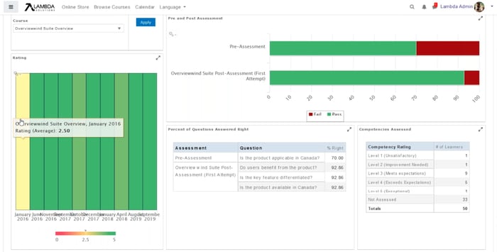 An example Learner Effectiveness Dashboard. For instructors, dashboards could include learning analytics insights on course feedback, assessments, and competencies.
Key Learning Analytics Feature #4 - Scheduler
If you want a manager to see how assessment results have changed at the start of every week, or if an associate is requesting sales for every quarter, a time-based scheduler needs to be an essential feature of your analytics platform. With auto-reporting and sharing, you can ensure every request for insights and updates gets an easy and efficient response.
When you’re dealing with more than one set of data, scheduling tools also help to keep on top of things, and monitor how each aspect of your training is contributing to ROI. For instance, you might schedule your eLearning data to report weekly, alongside a monthly report for eCommerce data.
You can also schedule by groups, to track customers or invoices. This can help to visualize how your store is progressing, for example, by comparing sales month over month, or period over period.
Alternatively, see how a coupon code or discount affected sales orders by scheduling reports before, during, and after the promotion. Understand how effective previous promotions were, and track which courses are losing popularity, to develop an idea of which products will make good candidates for your next promotion cycle.
Over time, regularly scheduled reports can lead to big insights. In this webinar case study, we cover how ProTrain—a global leader in educational services—found success by employing analytics and reporting tools to actively analyze their data. Watch today: Sync or Swim: Streamline Online Training to Increase Your Bottom Line
Ready to keep climbing down the Learning Analytics rabbit hole? Here’s what we’ve got for you:
- eBook: LMS 101: Learning Analytics
- eBook: The Practical Guide to Evaluating Your Workplace Learning Effectiveness
- Webinar: How To Utilize Data To Improve Operational and Learning Effectiveness
- Webinar: Top 5 Tips for Keeping Reporting Simple
- Article: What Are The Most Important KPIs for LMS eLearning?
- Article: The Most Beneficial metrics for eLearning and Why You Should Track Them
- Article: Healthcare Analytics: Why Educators Are Using Blended Learning and Big Data in Healthcare
- Article: Learning Analytics: The Art and Science of Using Data in eLearning
- Article: Analytics Reporting: How to tell if your quizzes are passing the grade


