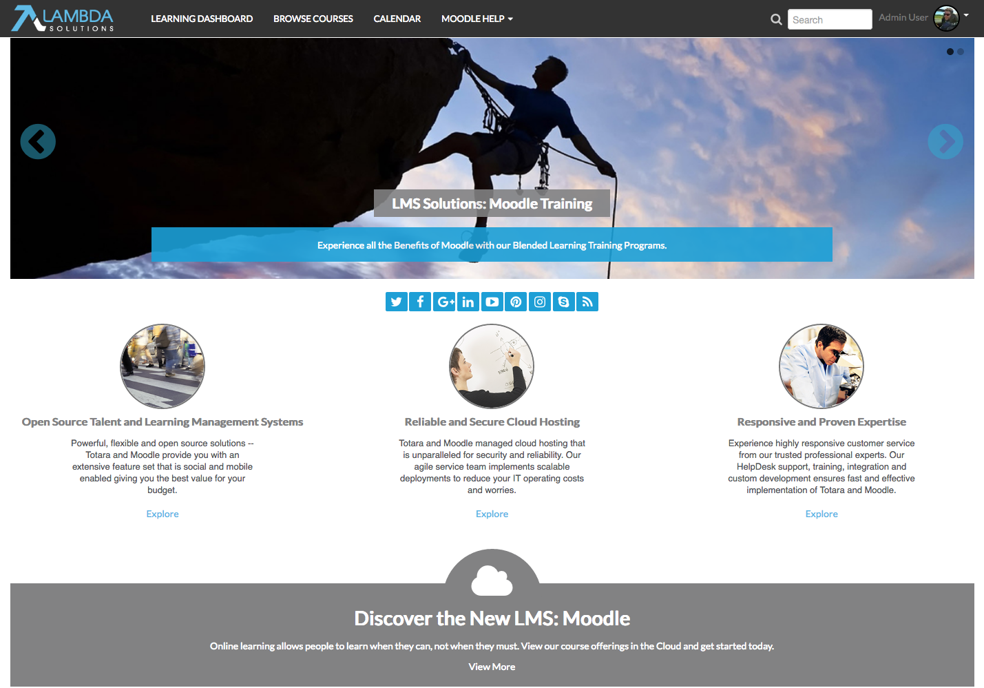
 In a report published by Brandon Hall Group this year, it was revealed that 88% of organizations switching LMS did so for improved User Experience. The most overlooked component of user experience, is your LMS theme. A good LMS theme will create a seamless user experience, which enhances the learner engagement, and makes your users more comfortable.
That's why Lambda Solutions has equipped the newest release of their Configurable Theme (Lambda Liquid) with extensive customization options to provide an enhanced, and more seamless user experience.
Why Your LMS Theme Matters
The design of your theme focuses on your site’s overall look and feel - this is important, because colour, fonts, and layouts are the first elements that learners will notice when engaging in your LMS. This is why a good theme can be effective in engaging your learners, and making your courses easier to work through.
In addition, a good LMS theme can reinforce your organization’s branding, making the transition from your website to your LMS site seamless. The result is an eLearning course that is easy to engage with, properly branded to match your website, and more effective in its delivery of learners to users.
What Does Lambda’s Configurable Theme Deliver?
Our clients have expressed a need for greater flexibility and customization options in our Lambda Configurable Theme, especially in the heading area of the configurable theme. Much of this has to do with wanting to enhance the user experience by aligning their LMS with their organization's brand. To provide for our clients, we have added new capabilities with the release of version 1.2., providing enhanced capabilities to customize the theme to match user’s brands.
Let’s go over some of the features and capabilities available in the Lambda Liquid Theme.
The Lambda Liquid Theme works with existing frameworks, including:
- Bootstrap: the most popular HTML, CSS and JS framework for developing responsive, mobile-first projects on the web
- Font Awesome: Gives you scalable vector icons that can instantly be customized - size, colour, drop shadow, and anything that can be done with power of CSS.
Navigation, and what can be done with the out-of-the-box features of Moodle and plugins.
- The Course Module Navigation: this block allows for a more concise course navigation to be added to the pages, which shows the topics and learning resources with a completion status.
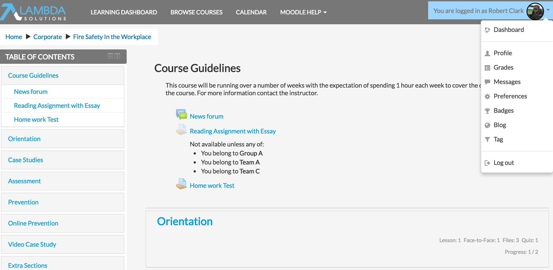
(Course Navigation)
- The Custom Menu: This menu comes with Moodle, and can be configured or changed within Moodle without requiring coding.
- The User Menu: This is a user centric menu that offers access to things such as a user’s profile and grades. Like the custom menu, the user menu offers customization abilities.
Course Format and Layout:
- Collapsed Topics: When looking at how your course is organized, there are options to consider. For example, how long will the course be? Does it make sense to have sections collapsed?
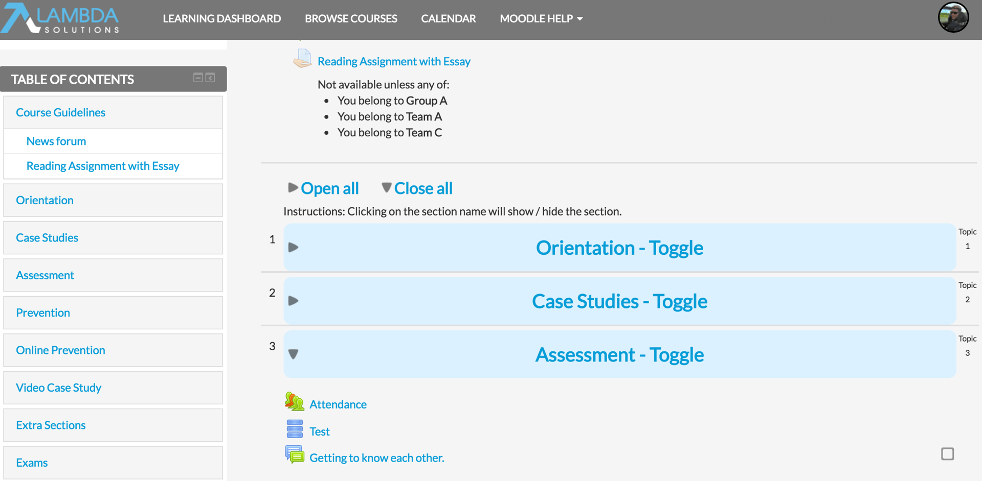
(Collapsed Topics)
- Social Wall: This is a course format that center’s the course around a topic of discussion, instead of a bunch of learning activities. This works well for courses acting as user groups or discussion areas where the conversation might be free flowing around a general topic of discussion. This format also lends itself well to an instructor posting pieces of information using the existing resources and activities available in more of a drip-feed approach.
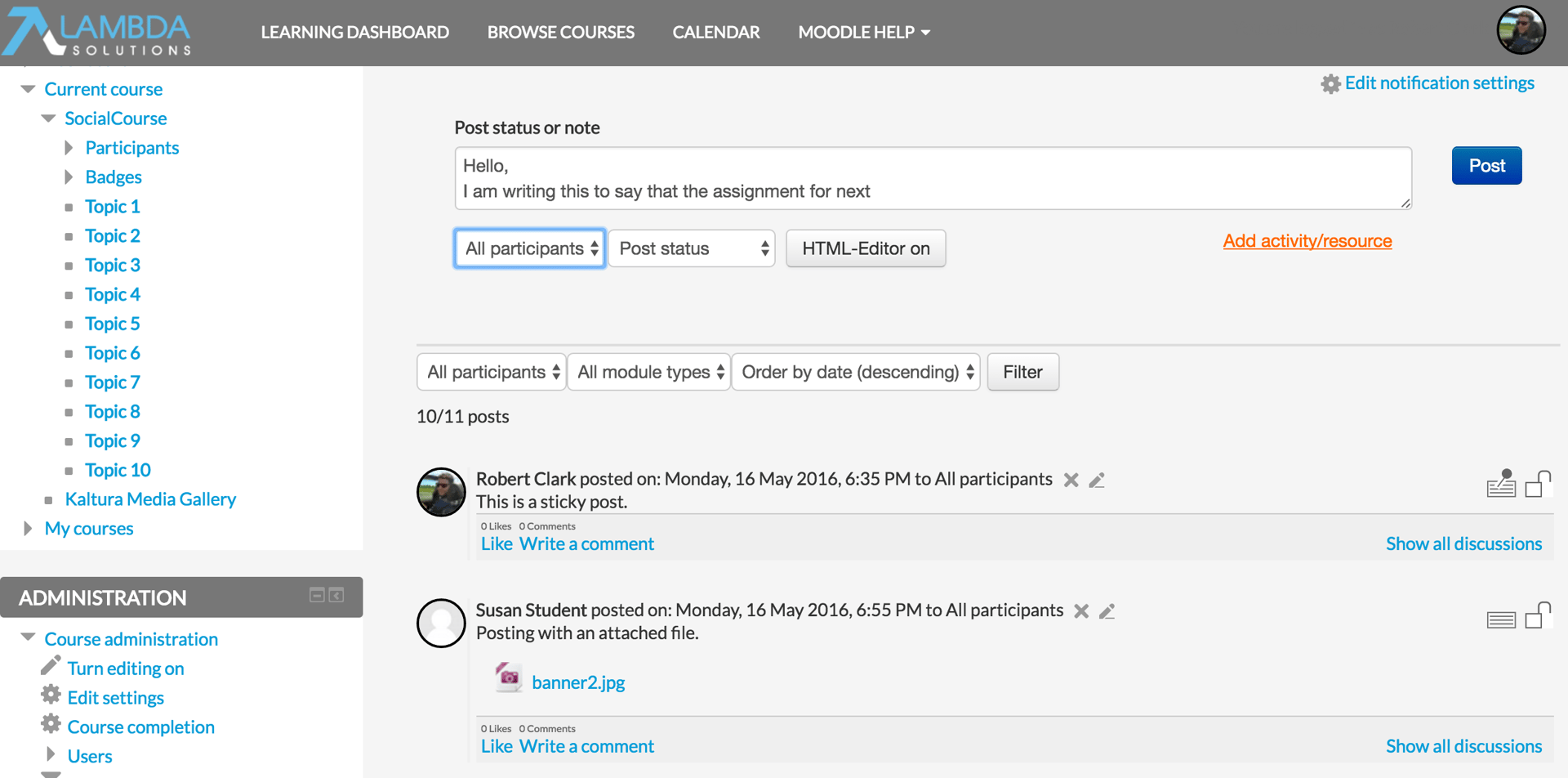
(Social Wall)
- Buttons: This creates a menu with buttons in javascript, so you can access each individual section. Buttons are customizable.
Register for our upcoming webinar, Building your Brand in your LMS, to learn how you can use your LMS theme to increase user experience.
